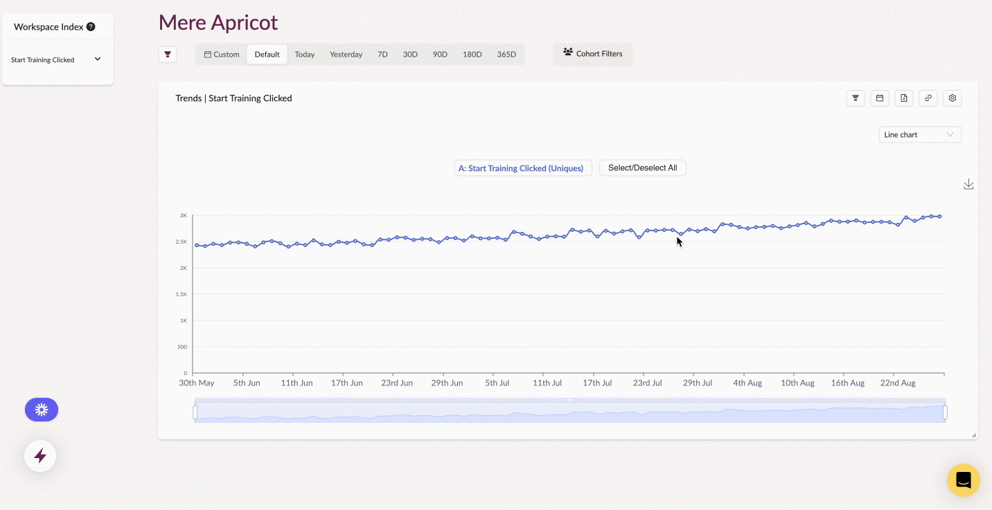
Trends
Learn how to create Trend charts on Houseware
The Trends type of visualization is the best way to analyze metrics and compositions within your event data using line charts or table views. Advanced features like formulas are useful for comparing and customizing metrics on the event data. Houseware lets you create these Trends in just a matter of a few clicks.
Trends on Houseware
What is a Trend?
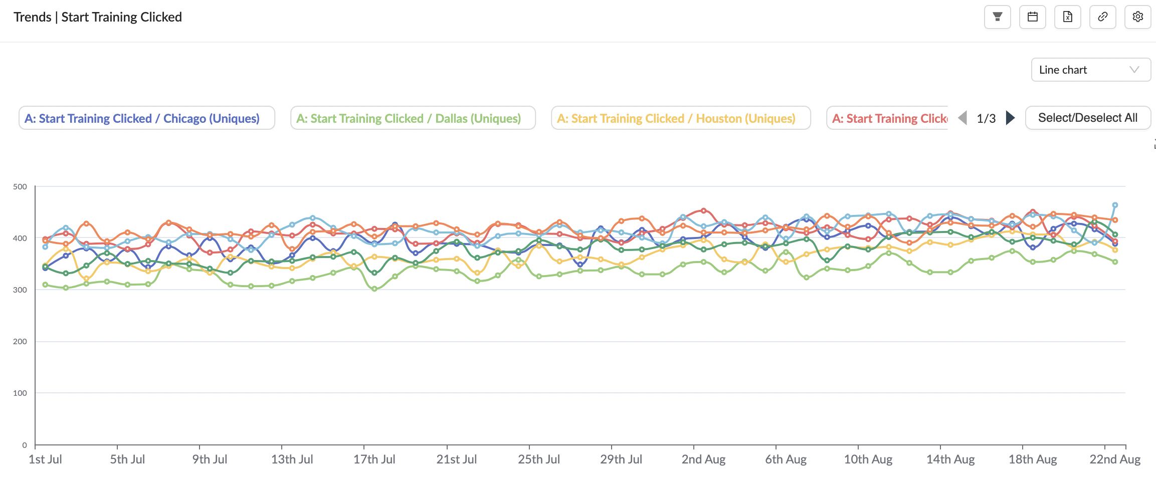
A trend chart helps visualize and analyze key product metrics, like the number of users performing a certain event, the number of different countries users are logging in from, the composition of these metrics, and more. You can observe these numbers in both line charts and table views.
A Trend visualization can help you answer the following types of questions:
- How many HomePage visits happened in the US in the past 30 days?
- How many users initiated the "Search" event yesterday?
- How many games are played per user in the past week?
- Which sources generate the most signups?
... and so on!
Step-by-step guide to creating a Trend chart
Follow the steps given below to create a Trend line chart or table view on Houseware.
Step 1: Add a new Trends visualization block to your workspace
Add a new visualization block on your workspace and choose Trends as the visualization type. Once the block is created, configure it based on what you want to track.
Step 2: Select an Event(s)
Select the event(s) you want to visualize in the config menu on the right side. You can add up to 8 events.
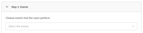
Select event(s)
Note: By default the "Calculation" (counting criteria) field, when you choose any event, is "Uniques". Head to the Advanced config section to learn more about this, and the other options available here.
These are the only necessary steps to create your Trend chart. Once completed, you can click on the Apply Configuration at the bottom of the config modal, and your Trend chart will be up. 🎉
Advance Config Features
Here are some more features like filters, breakdowns, change views, etc., that will help you tweak your Trend chart as per your requirements.
Add event-level filters
If desired, you can add event property filters to your events by clicking on the Add Filter icon, selecting the property name, and specifying the property value you’re interested in. You can narrow your focus more by clicking on the Add Filter icon multiple times to add multiple event property filters. Multiple event property filters are combined using the AND function.
Calculation field (after selecting event)
You can choose from 4 options based on what type of trend you want to see for the event.
- Uniques: Number of unique users who performed the event.
Uniquescounts one event per user
- Totals: Total number of events performed.
Totalscounts every occurrence of the event.
- "Totals per User": Number of times one user performs that event
- You can choose from seeing the average, maximum, minimum, median, or percentile of this with respect to all users.
- "Aggregate Properties": Number with respect to different properties associated with the event.
- If your property is a non-integer property, you can see the number of distinct types of the property that did the event. For example, you can see the number of different countries from which users logged in on a particular day/
- You can do things like average, max, min, and more for integer properties.
Formula
Use Formulas for calculating and comparing custom metrics on the same chart. You can write formulas using simple arithmetic operators that Houseware will apply to the events you've included in your analysis.
Houseware supports the following operators:
- Add +
- Subtract -
- Multiply *
- Divide /
- Use parentheses to influence the order of operations ()
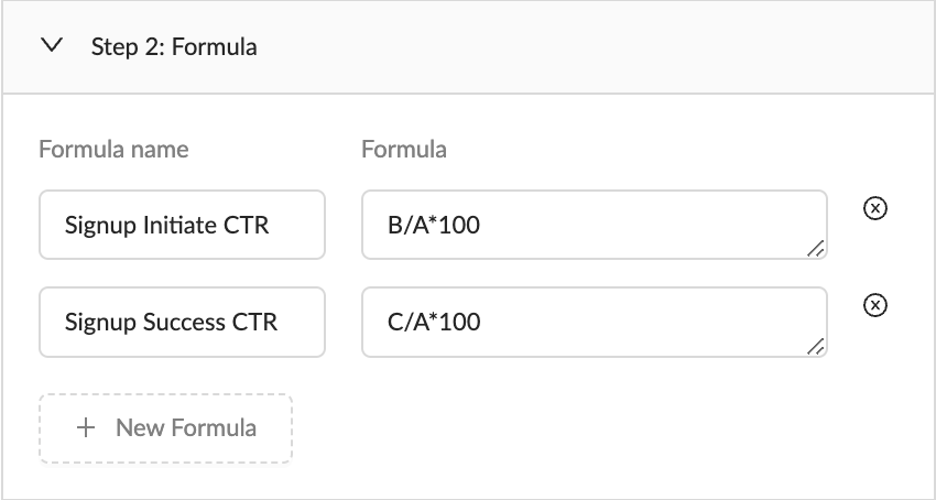
Adding formulas
- Formula name: Enter a name/alias for the formula.
- Formula: Each event in Step 1: Events shows a letter next to it, which indicates its variable name. Use these letters (case-sensitive) in combination with the operators to calculate a custom formula. You can also use numbers as constants in a formula. For example, multiply a ratio by 100 to display it as a percentage.
Some ways in which you can use Formulas
- Event ratio percentages: B/A*100
- A is
HomePage (Uniques). The number of users who visited the HomePage. - B is
SignUpSuccess (Uniques). The total number of HomePage visits. - B/A*100 will display the percentage of users who signed up successfully to users on a denominator of the number of users who visited HomePage.
- A is
- Average page visits per user: B/A
- A is
HomePage (Uniques). The number of users who visited the HomePage. - B is
HomePage (Totals). The total number of HomePage visits. - B/A will display the Average page visits per user.
- A is
- How many more times do users in one cohort trigger a particular event than users in another cohort?:(A/B)/(C/D)
- A is
HomePage (Totals)with a filter country equals US. The total number of HomePage visits by US users. - B is
HomePage (Uniques)with a filter country equals US. The total number of US users who visited HomePage. - C is
HomePage (Totals)with a filter country equals VN. The total number of HomePage visits by VN users. - D is
HomePage (Uniques)with a filter country equals VN. The total number of VN users who visited HomePage. - (A/B)/(C/D) will display how many more times US users visited HomePage than VN users.
- A is
Choose Trend View
You can view the Trend chart in two primary ways:
- Line Chart: Line charts help you understand how an event metric trends over time.
- Table view: The metrics in the table view can be viewed as
- period-on-period counts (Daily/ Weekly/ Monthly)
- aggregated counts (All time) over the selected date range.
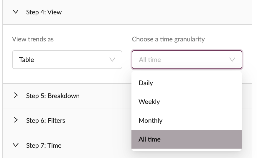
Select the time granularity to see daily, weekly, monthly or all time
Both the views can be configured to be viewed at any time granularity - day, week, month, or all time.
Breakdown
Breakdown segments data into groups. Breakdown enables you to go deeper and understand and compare the drivers for event metrics, across common event-wide dimensions such as country, device_type, etc., or even specific event properties.
Breakdown on Trend chart
Trends allow you to breakdown by all properties associated with the events chosen for the chart.
For example, if you had a Trends visualization with 3 measures:
- 2 events (in Step 1),
- and a formula (in Step 2),
and were to break down by country, Trends would show you results for each of these 3 measures (each configured event in Step 1 and the formula in Step 2), for each individual country (or, to be more technical, for each instrumented value of that property for which there were any results).
Thus, the Trends visualization with 3 measures broken down by the property country (with 2 values: US and VN), would have 6 =(2+1)*2 lines (one for each country).
If you had 100 countries, you would have 300 lines, which would become difficult to visualize. Read the next section on how Houseware handles this.
Restrict the number of lines on the line chart
Add a Sort By condition
In case the cardinality of the chosen dimension is high, the visualization on a line chart can become difficult to read because of the large number of lines (various (event/formula)-dimension combinations).
For eg., There may be a hundred possible country values, and the breakdown on a Trends chart will break down each Trend into 100 (multiplying the number of lines on the chart by 100). In this case, you may only want to visualize Trends for the top few countries sorted by the counts of the following:
- A (HomePage-Uniques) in Step 1, or
- B (SignUpSuccess-Uniques) in Step 1, or
- the formula B/A in Step 2.
Houseware allows you to restrict the breakdown groups by the top/bottom dimension property values to make for a more elegant visual analysis on a line chart. Add a Sort By condition on the event/formula that you wish to sort by. The dimension property values are sorted based on their Trend count (averaged over the selected date range).
In the previous example, you can add a Sort By A: HomePage (Uniques) Descending, which will show you all Trends for the top countries selected by sorting on A: HomePage (Uniques) counts.
- You can only group(breakdown) each event by a maximum of one property.
- The line chart presents a maximum of up to 12 trend lines, sorted by the average counts for the selected (event/formula)-dimension combinations.
- To further restrict the breakdown to a handful of dimension values, you can apply relevant filters on the same dimension
Add Filters
In addition to the event-level filters, you can apply filters for the entire Trends block, common across all events. Filter each step based on dimensions like country, device_type, slot, experiment, etc., and even cohorts.
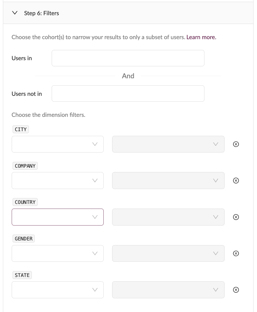
Apply filters on Trends
Feature Highlight: You can use in-built Houseware properties to filter your users.
newExisting: A user is said to be New if they have registered within the last 30 days. Any user who registered before that date range is said to be Existing.loggedInUser:
- To filter for events triggered by logged-in users, set the filter
loggedInUserequalstrue.- To filter for events triggered by non-logged-in users, set the filter
loggedInUserequalsfalse.
Filter by time
You can choose the time frame you want the retention to be computed.
There are multiple ways to select the time:
Between Dates
Choose a start date and an end date (both inclusive). Trend will be calculated over events data in this date range
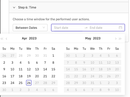
Between dates filter
Within the Last n Days
Calculate retention for the last 3/7/14/28 days. Last n days is a rolling date window to keep your retention up to date
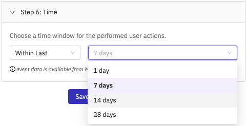
Within the Last n Days filter option
Updated 9 months ago